


 904 1030

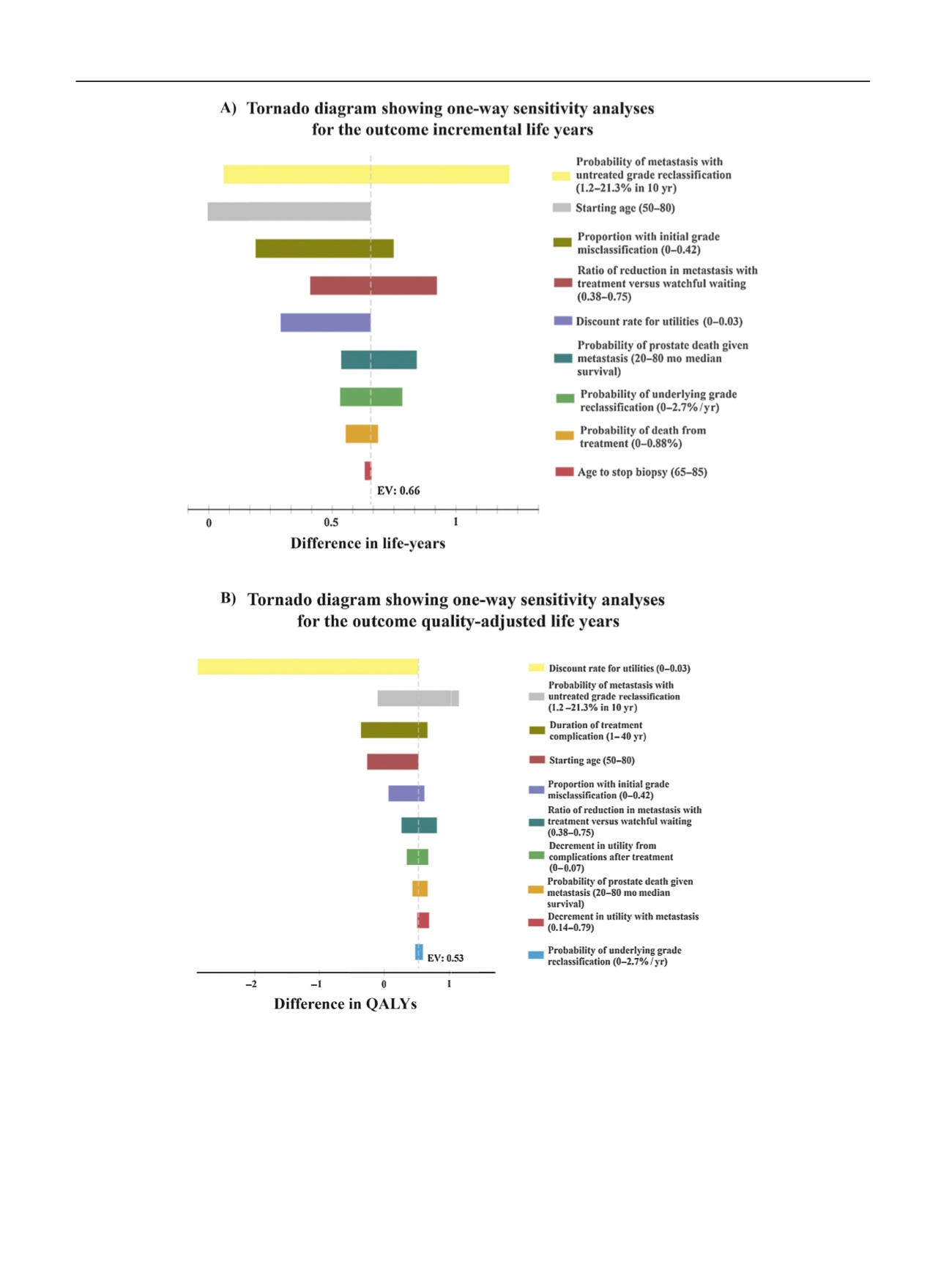
[(Fig._2)TD$FIG]
Fig. 2
–
Tornado diagram showing a series of one-way sensitivity analyses of key variables for the outcome of (A) LYs and (B) QALYs comparing AS (Johns
Hopkins) with WW. The tornado diagram for incremental LYs (or QALYs) shows how the difference in LYs (or QALYs) between AS and WW changes when
the value of a parameter varies. The
X
-axis shows the difference in LYs (or QALYs) between AS and WW. The dotted line shows the difference in LYs (or
QALYs) for the base case analysis, where AS has 0.66 more LYs (or 0.53 more QALYs) than WW. Each bar shows how much the difference in LYs (or
QALYs) changes when we change a specific parameter within its range. If a bar crosses
“
0
”
in
X
-axis, it means that AS has less LYs (or QALYs) than WW
and therefore the decision is reversed. AS = active surveillance; LY = life year; QALY = quality-adjusted life year; WW = watchful waiting.
E U R O P E A N U R O L O GY 7 2 ( 2 0 17 ) 8 9 9
–
9 0 7
904